CD Front Cover Design 1:
This is our first idea for our CD cover. We tried to emphasise on the album name; 'Still Not Broken' by portraying the artist on one side broken however on the other side she is complete. The message indicated to the audience with this cover could be how individuals in relationships tend to go through a lot and at some point when the relationship ends, the female persona is usually half broken and not complete without her partner.
CD Front Cover Design 2:
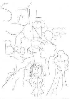
This was our second design of the CD front cover. This drawing shows that she is still not fully broken. This is an close up of her face and if this design is chosen we will use crack effects to make it look more effective and for the cover to stand out to the audience.
CD INLAY DESIGNS
CD Inlay Design 1
CD Inlay Design 2
This was another design for the inlay. This is just a very simple design of the artist looking directly at the camera. however this can be criticised because audiences look for something that appeals to them and is eye catching. This design shows Sandhya as a proud woman and this can also connote her success.
CD Inlay Design 3
This was the third design for the inlay. This shows her fragmented state of mind and that she is shattered like a glass. However we will not be using this design as it does not connote a clear message to the audience and again we want something positive and not base it all on negative emotions.
CD BACK COVER DESIGNS
We created a design for the CD back cover from using knowledge of pre-existing back album inserts. Our design shows typical conventions that buyers would want to see on a back cover such as : a bar-code, a track list, the artists' name, album name, website, timings of the songs. This design was inspired from an insert we found on the internet.
MAGAZINE IDEAS:
Chosen Design:
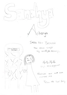
This is our chosen design for our Magazine advert where we see the Artist by a phone box. This is how our magazine advert will roughly look however there are a few details missing such as the artist name and the number one single.

Other magazine designs:


.jpg)


No comments:
Post a Comment